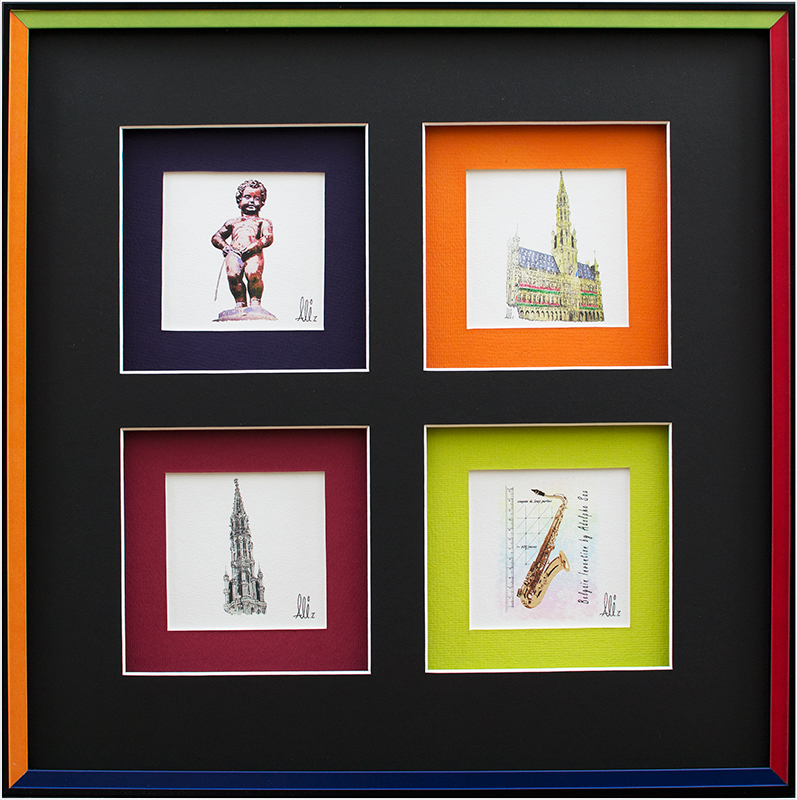
Tips for Using Colored Mat Boards May 15 2016
When choosing the mat you use inside your framed artwork there is more to consider then what you may think, it is also more important than you might think. There are two reasons for matting art: It keeps the glass separated from your artwork so it won’t stick to the glass, and it enhances your artwork. And a mat gives needed space so your eye can hone in on the art and it does not get cut off in the frame, especially when you use chunky frames.  Here are some more tips:
1. Choose your mat color based on what will best compliment the artwork — not the space you are hanging it.

2. Seek balance between the art and the framing that surrounds it. Avoid using the dominant colors in the art as the dominant colors in the framing. Instead, identify secondary colors in the art that share the prevailing value and temperature of the art as a whole.


Sources
http://www.houzz.com/ideabooks/653859/list/the-right-mat-for-your-artwork
http://phoenixartsupplies.com/custom-picture-framing/images/multi-colored-picture-frame.jpg
http://ecx.images-amazon.com/images/I/41YxDXSRo%2BL._AC_UL320_SR262,320_.jpg
https://s-media-cache-ak0.pinimg.com/236x/dd/eb/7f/ddeb7f631d379bd940ea2408f8cb3643.jpg
Picking out a Mat August 24 2015

Types of Mat
The purpose of adding mat to your prints is to protect and preserve it from damages as well as adding style. The mat separates the artwork from the glass to prevent it from sticking and fading out. There are many different routes you can go while choosing a mat for your prints such as the type, the style, the size and more.
The Types
Paper - This mat is made of paper pulp and it the cheapest mat to get. Often times when you buy a frame this is the mat that is already in it. This type can easily turn brown and the pure white will fade away. To prevent this from happening you can go to a framing store and ask them to switch out the paper mat for a different more durable type.
Alpha Cellulose - Made of wood pulp to prevent decaying.
Rag - Made from cotton. The most effective choice for keeping artwork safe because there is no acid in it and it keeps the edges white forever. It is also the most popular among museums and professionals.Sizing:
- Basic sizing is two to three inches of mat. But don’t be afraid to go bigger, if your piece is larger than 11” x 14” try a bigger mat to properly scale it. The mat is supposed to draw the eye toward the piece and based on coloring even toward a specific element in the piece.
- If your matting photographs go with a wider mat to create a contemporary yet polished look.
- When done right, pairing an oversized mat with a small picture can attract the eyes towards the picture and create a strong presence for the art piece.
Color:
- Pick the color based on what best compliments the art work.
- Stick to neutral tones in the gray/taupe scale. Try to stay away from colors that are either brighter or darker than the image you are framing.
- If you do want to add in color, layering mats is a great way to do so. Using a bolder color on the first thin layer will allow the picture to pop without overwhelming the art .