Tips for Using Colored Mat Boards May 15 2016, 0 Comments
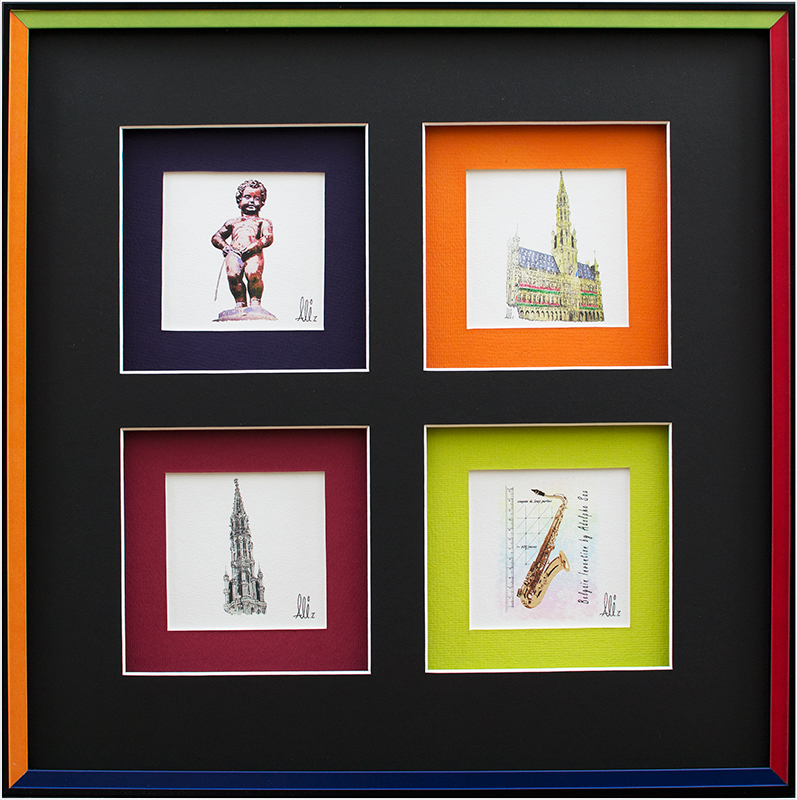
When choosing the mat you use inside your framed artwork there is more to consider then what you may think, it is also more important than you might think. There are two reasons for matting art: It keeps the glass separated from your artwork so it won’t stick to the glass, and it enhances your artwork. And a mat gives needed space so your eye can hone in on the art and it does not get cut off in the frame, especially when you use chunky frames.  Here are some more tips:
1. Choose your mat color based on what will best compliment the artwork — not the space you are hanging it.

2. Seek balance between the art and the framing that surrounds it. Avoid using the dominant colors in the art as the dominant colors in the framing. Instead, identify secondary colors in the art that share the prevailing value and temperature of the art as a whole.


Sources
http://www.houzz.com/ideabooks/653859/list/the-right-mat-for-your-artwork
http://phoenixartsupplies.com/custom-picture-framing/images/multi-colored-picture-frame.jpg
http://ecx.images-amazon.com/images/I/41YxDXSRo%2BL._AC_UL320_SR262,320_.jpg
https://s-media-cache-ak0.pinimg.com/236x/dd/eb/7f/ddeb7f631d379bd940ea2408f8cb3643.jpg